How to Make a Duotone in Photoshop (Gradient Map vs Duotone Mode)
Photoshop has two duotone features and the one named Duotone is usually the wrong one. Why Image > Mode > Duotone demands a Grayscale conversion, why Gradient Map is what you actually want, and how to keep it editable.
Photoshop has a menu item called Duotone, and for the thing most people mean by "duotone" it is the wrong tool. That is the whole confusion here, and it has a specific origin: Image > Mode > Duotone is a prepress feature. It exists so a printer can run a greyscale image through two ink plates instead of one — a genuine cost-saving technique from the era when four-colour printing was expensive. It is not a colour effect, and to reach it you must first convert your image to Grayscale, which discards every colour channel permanently.
What you almost certainly want is Gradient Map, which maps the image's tonal range onto a gradient you define, works on an RGB file, and lives as an adjustment layer that stays editable forever.
Here is the decision in one table:
| What you are doing | Use |
|---|---|
| A two-colour graphic treatment for screen or design | Gradient Map |
| Matching a brand palette | Gradient Map |
| Something you will tweak later | Gradient Map |
| Preparing a file for a two-ink press run | Image > Mode > Duotone |
| Working with Pantone spot inks and a print vendor | Image > Mode > Duotone |
Method 1 — Gradient Map, the one you want
Add a Gradient Map adjustment layer
From the Layers panel — the half-filled circle icon — not from
Image > Adjustments. The menu version bakes the effect into pixels; the adjustment layer keeps it live.Click the gradient to open the editor
You get a ramp with a stop at each end. The left stop maps to the darkest pixels, the right stop to the lightest. That direction is the single thing to remember.
Set the two colours by hex
Double-click a stop to open the colour picker and type your value. Dark brand colour on the left, a light tint on the right.
Reverse if it comes out looking like a negative
The Reverse checkbox flips the mapping. If your subject reads as a photographic negative, this is the fix — not swapping the two colours by hand, which does the same thing with more clicks.
Add a third stop if the mid-tones look muddy
Click anywhere along the ramp to add a stop. A mid-tone between two clashing endpoints — the grey-brown you get halfway between yellow and purple — is what makes faces look ill in a duotone. One well-chosen middle stop fixes it, and technically makes it a tritone, which nobody will mind.
Method 2 — Image > Mode > Duotone, for print
Best for: an actual two-ink press run, in conversation with a printer who has told you which inks.
Convert to Grayscale first
ImageModeGrayscale. The Duotone option is greyed out until you do, and this conversion is destructive — flatten a copy, never your master file.
Switch to Duotone mode
ImageModeDuotone. Set Type to Duotone for two inks (Monotone, Tritone and Quadtone are also here).
Choose the inks
Click each colour swatch. For real print work these should be Pantone or other spot colours your printer specified — not arbitrary RGB values, which defeats the entire purpose of the mode.
Adjust the ink curves
Click the curve box beside each ink. This is what the mode is really for: controlling how much of each ink lands at each tonal value. Ink 1 usually carries the shadows, Ink 2 lifts the mid-tones.
Save as PSD or EPS
Duotone mode information survives in PSD and EPS. Export to PNG or JPG and it is converted back to RGB — at which point you have gone a long way round to get something Gradient Map would have given you non-destructively.
Choosing the two colours
The same rules as anywhere, with one Photoshop-specific addition.
Maximise the lightness gap. Two mid-tones give you a flat, low-contrast result. Dark shadow, light highlight.
Watch the interpolated middle. Photoshop blends in RGB by default, which takes some colour pairs through unattractive territory. Selecting the gradient's smoothness and adding a mid stop is the fix.
Use the image's own colours as a starting point. Sampling two values that already exist in the photo tends to produce a duotone that still reads as the same scene. Extracting a palette from the image gives you candidates, and monochromatic ramps are the family that fails least often.
Check it in sRGB. A Gradient Map built in Adobe RGB will not match the hex you typed once it is on a web page. EditConvert to Profile before exporting anything screen-bound.
What goes wrong
When Photoshop is the wrong tool for this
Gradient Map is the most capable duotone control of the three tools here, and the gap is real: a third stop, per-channel luminance weighting underneath, a layer mask so the effect covers part of the frame, and adjustment layers that copy cleanly between files for a consistent set. If you are producing a photo treatment for a campaign, this is where to do it.
It is a poor fit for the ordinary case. Two colours onto one image is conceptually a two-value operation, and getting there involves knowing that the menu item named Duotone is a trap, that adjustment layers must come from the Layers panel rather than the Image menu, and that the left stop is the shadows. That is a lot of Photoshop-specific knowledge for a treatment you wanted to try in thirty seconds.
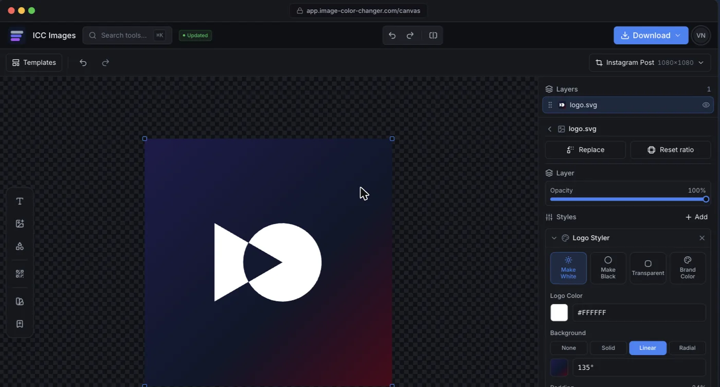
ICC Images has it as one step. Upload, apply a duotone, set the two stops by hex, download — no mode conversion, no layer stack, nothing destructive. Editing and previewing are free and need no account; a full-resolution download needs a free sign-in and spends credits.