Color Palette Generator
Pick a starting color and instantly see five color-theory palettes — analogous, complementary, triadic, split-complementary, and monochromatic. Copy any hex code in one click.
Generate Palettes from Any Color
Enter a hex code or pick a color — five harmony types update instantly.
Analogous
Five adjacent hues — naturally harmonious, low contrast, great for backgrounds.
Complementary
Your color + its opposite — high contrast, energetic, ideal for CTAs.
Triadic
Three equally spaced hues — balanced variety without tension.
Split-Complementary
Base + two colors flanking its complement — dynamic yet easier to balance.
Monochromatic
Tints and shades of one hue — minimal, cohesive, easy to get right.
Rules for Building a Great Palette
Color theory distilled into six principles every designer should know before picking their first swatch.
The 60-30-10 Rule
Distribute your palette as 60% dominant (backgrounds, large surfaces), 30% secondary (cards, sidebars), and 10% accent (buttons, highlights, links). This ratio gives the eye a resting place while the accent draws attention exactly where you need it.
Color Harmony
Colors that share a geometric relationship on the wheel — adjacent, opposite, or evenly spaced — feel intentional rather than random. A complementary pair creates energy; an analogous set creates calm. Choosing a harmony type before picking individual shades is what separates a palette from a collection of colors.
Consistency Builds Trust
Repeated exposure to the same palette trains users to recognize your brand instantly — on a billboard, in an email, or in a dark-mode app. Inconsistency, even a slightly off-shade button, creates subconscious friction and undermines credibility. A defined palette eliminates guesswork for every person who touches the design.
Warm vs. Cool Balance
Warm hues (reds, oranges, yellows) advance visually — they feel closer and more urgent. Cool hues (blues, greens, purples) recede — they feel stable and calm. Pairing a warm accent with a cool background gives you natural hierarchy without changing size or weight. Most strong palettes use one temperature family for the majority and the opposite for the accent.
Starting from Your Brand Color
Your primary brand color is the seed — everything else is derived, not invented. Feed it into the palette generator and review each harmony type against your brand's tone. A law firm might choose monochromatic navy; a children's brand might choose triadic primaries. The palette should feel like an inevitable extension of that one anchor color.
When to Break the Rules
Every palette benefits from exactly one deliberate disruptor — a color that breaks the harmony slightly to stop the eye. This is usually the 10% accent. The rule is still "one disruptor": two competing accents cancel each other out and the design reads as chaotic. Use the harmony types to define the system, then pick the accent last.
Which Palette Type Do You Need?
Complementary
Two opposing hues
- Your color + its opposite on the color wheel
- High contrast — one color dominates, one accents
- Energetic, dynamic, attention-grabbing
- Used extensively in CTAs and conversion elements
Brands that want a bold accent color that pops against the primary
Designs where both colors are used equally — the tension becomes overwhelming
Analogous
3–5 adjacent hues
- Colors that sit next to each other on the wheel
- Low contrast, naturally harmonious
- Calm, cohesive, easy to live with
- Good for backgrounds and secondary elements
Wellness, lifestyle, editorial brands — any palette that needs to feel refined
When you need strong contrast between interactive elements
Triadic
Three evenly spaced hues
- Three colors equidistant on the color wheel
- Balanced but vibrant — more variety than complementary
- All three colors have similar visual weight
- Versatile across many brand contexts
Brands that need variety — multiple product lines, diverse content, broad audiences
Minimal brands or identities built around a very strong single color
How to Generate a Color Palette
Upload your logo
Load your logo so we can read its dominant color.
Open Palette Studio
Choose the Palette Generator from the toolbar.
Explore palettes
Review five harmonies, or pick a new seed color to regenerate.
Apply or copy
Apply a palette into Color Replace or copy the hex codes.
What Palettes Power
Brand Systems
A primary, secondary, and accent set from your logo.
Website Themes
Cohesive colors for backgrounds, buttons, and text.
Decks
Slides that stay on-brand from title to close.
Social Templates
Consistent color across every post you publish.
Works Seamlessly Inside Framer
No more switching between apps. Edit colors, remove backgrounds, and insert directly onto your Framer canvas — all without leaving your design flow.
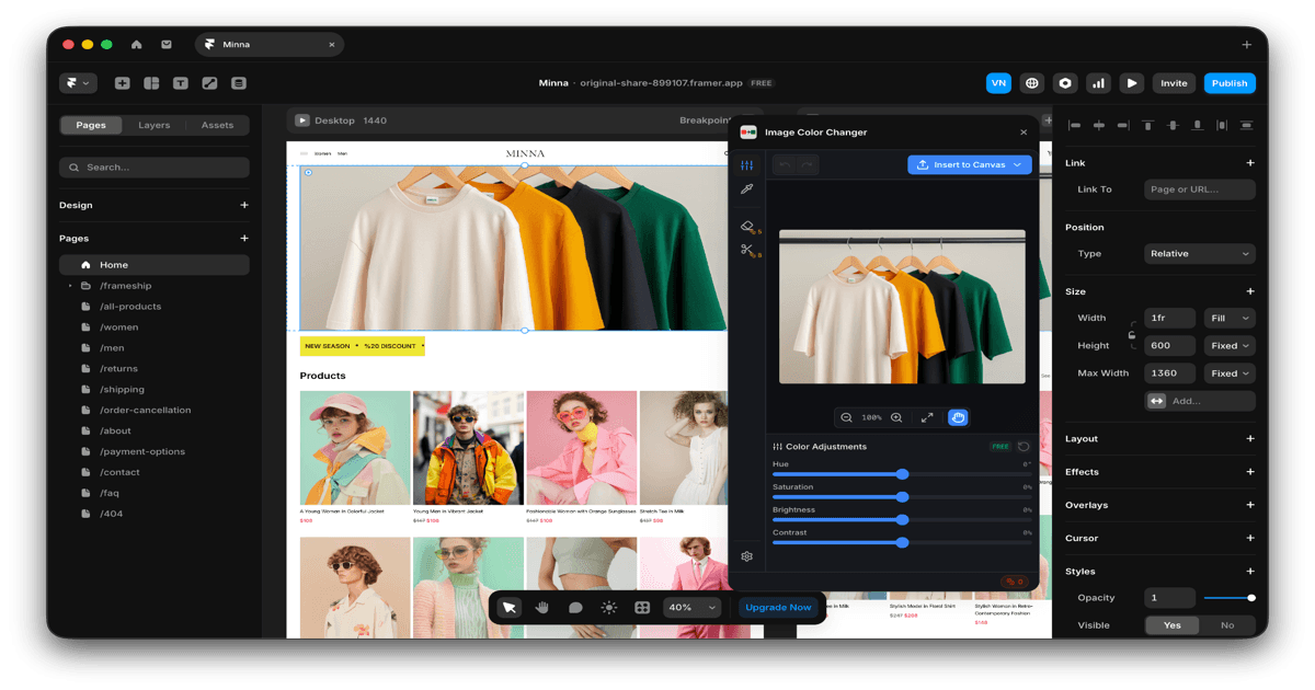
Native Plugin
Works directly inside Framer — no need to leave your design environment.
One-Click Insert
Edit your image and insert it straight onto your canvas instantly.
Real-Time Preview
See color changes live as you work on your Framer projects.
Loved by Designers Everywhere
Join thousands of designers who save hours every week with ICC Images.
“This plugin has completely changed my workflow. I used to spend 30 minutes in Photoshop just to change product colors — now it takes seconds.”
Sarah Chen
Freelance Web Designer
“The background removal is shockingly good. I've tried so many tools and this one actually handles hair and complex edges properly.”
Marcus Johnson
E-commerce Designer
“Finally a color tool that works directly in Framer. No more exporting, editing, re-importing. Just click and done.”
Elena Petrova
Product Designer at Startup
“I use this daily for client mockups. Being able to show the same product in 10 different colors in minutes is a game-changer.”
James Wright
Brand Designer
“The eyedropper tool is incredibly precise. I can match brand colors perfectly every single time.”
Aisha Patel
UI/UX Designer
“Worth every credit. The time I save pays for itself on the first project of the month.”
Tom Mueller
Agency Creative Director
ICC Images Pricing
Start free with 5 credits. Upgrade only when you need more. Cancel anytime.
No subscription, no auto-renewal, no commitment
All plans include a 14-day money-back guarantee. No questions asked.
Frequently Asked Questions
Common questions about our palette generator tool
Ready to Find Your Palette?
Join 8,000+ designers using Image Color Changer to build cohesive brand palettes. Start free with 5 credits.