How to Change a Logo Color in Photoshop (5 Methods, Step by Step)
How to recolor a logo in Photoshop: Hue/Saturation, Color Overlay, clipped fill layers, Replace Color and vector logos — plus the export traps to avoid.
There are at least five ways to change a logo's color in Photoshop, and the one most tutorials teach you first — grab the Magic Wand, select the shape, fill it with a new color — is the one most likely to leave you with a ragged edge and a halo of the old color. This guide covers all five properly: what each one does, the exact menus and settings, when to use it, and what it quietly breaks.
If you only read one section, read Method 3. A Solid Color fill layer clipped to your logo layer is non-destructive, gives you an exact hex, preserves the anti-aliased edges, works on black and white logos, and lets you swap the color later with a double-click. It's the method professional designers reach for, and it takes about fifteen seconds once you know it. The other four all have their place — Method 4 in particular is the only sane approach for a multi-color logo — but Method 3 is the default. If you'd rather skip Photoshop entirely for this, our own logo color changer does the same job in the browser, and there's a section at the end on when that's the smarter call.
Before you start: your file type decides the method
The single biggest source of frustration here is applying a raster technique to a vector logo, or a vector technique to a flattened JPG. Work out what you actually have first.
| What you have | What it means | Best method |
|---|---|---|
| Transparent PNG, logo on its own layer | The alpha channel already isolates the logo | Method 3 (fill layer + clipping mask), or Method 2 |
| Flat JPG, logo on a white background | No transparency — you have a background problem before you have a color problem | Remove the background first, then Method 3 |
| Multi-color logo (raster) | Several colors, you only want to change one | Method 4 (Replace Color / Color Range) |
| Photoshop shape layer | True vector inside the PSD | Method 5 — change the Fill directly, no tricks needed |
Placed .ai / .eps / .pdf Smart Object | Vector living inside a Smart Object container | Method 5 — edit the original, it updates everywhere |
Three setup habits before you touch a slider, all of which will save you later:
Work non-destructively
Everything under ImageAdjustments permanently rewrites your pixels. Everything under LayerNew Adjustment Layer does the same thing as a re-editable layer you can turn off, re-tune, or delete. Use the second one unless a method genuinely offers no adjustment-layer equivalent — and when it doesn't, duplicate the layer first with LayerDuplicate Layer…, or press LayerNewLayer via Copy⌘J / Ctrl+J, which does the same thing when nothing is selected.
Unlock the Background layer
If your Layers panel shows a layer literally named Background with a padlock, layer styles and clipping masks will not behave. Convert it with LayerNewLayer from Background…, or just click the padlock icon.
Check your document mode and color space
ImageMode should read RGB Color and 8 Bits/Channel for anything web-bound. Then check EditColor Settings… — your RGB working space wants to be sRGB IEC61966-2.1. If your document is in Adobe RGB or a CMYK profile, the hex you type will not be the hex a browser renders. More on this below, because it catches almost everyone at least once.
Method 1 — Hue/Saturation with Colorize
Best for: shifting an existing colored logo to a different color, fast, when you don't need an exact hex.
The Colorize checkbox is the part people miss. Without it, the Hue slider rotates the colors already present — a red logo becomes blue, but a black logo stays black. With Colorize on, Photoshop discards the original hues entirely and paints every pixel with a single hue you choose.
Add the adjustment layer
Select the logo layer, then LayerNew Adjustment LayerHue/Saturation…. Name it something useful and click OK. (The destructive equivalent is ImageAdjustmentsHue/Saturation…⌘U / Ctrl+U — avoid it.)
Clip it to the logo
The new adjustment layer will otherwise affect everything beneath it. In the Properties panel, click the small clip icon at the bottom left (a square with a downward arrow), or use LayerCreate Clipping Mask⌥⌘G / Alt+Ctrl+G.
Tick Colorize, then set the hue
In the Properties panel, check Colorize. The Hue slider now maps 0–360 around the color wheel; Saturation controls intensity, Lightness pushes toward white or black. Drag Hue to the family you want, then use Saturation and Lightness to land on the shade.
Method 1 is genuinely good for one thing: taking a photograph or a colorful illustration and tinting the whole thing to a brand color. For a flat logo, the next two methods are better.
Method 2 — Color Overlay layer style
Best for: a single-color logo that already sits on its own layer with transparency around it.
A layer style paints over everything on the layer while respecting its transparency, so the anti-aliased edges of your logo carry through cleanly. It is non-destructive, it re-opens for editing at any time, and — the part that makes it genuinely useful — you can copy it onto other layers in one action.
Open the layer style
Double-click the layer's thumbnail in the Layers panel (not its name — that renames it), or go to LayerLayer StyleColor Overlay….
Set the color
In the Color Overlay pane, leave Blend Mode on Normal and Opacity at 100%. Click the color swatch to open the Color Picker, then type your brand hex into the
#field. Click OK twice.Reuse it across other layers
Right-click the layer in the Layers panel and choose Copy Layer Style, then select any other layers, right-click, and choose Paste Layer Style. Every mark in a multi-layer lockup gets the same exact color in one move.
The limitation of Method 2 is that it recolors the entire layer. If your logo has two colors on one layer, Color Overlay flattens both to the same color. For that, you want Method 4.
Method 3 — Solid Color fill layer + clipping mask
Best for: almost everything. This is the default.
A Solid Color fill layer is a layer that is nothing but one color. Clip it to your logo layer and it can only paint where the logo has pixels — the clipping relationship uses the logo's own transparency as the mask, which means anti-aliased edges are handled at exactly the right opacity, automatically. No fringing, no manual selection, no rebuilding the edge.
Select the logo layer
Click it in the Layers panel so the fill layer lands directly above it.
Add the fill layer
LayerNew Fill LayerSolid Color…. Give it a name — "Brand Blue" beats "Color Fill 1" when you come back in three months — and click OK. The Color Picker opens immediately; type your hex into the
#field and click OK.Clip it
With the fill layer still selected, use LayerCreate Clipping Mask⌥⌘G / Alt+Ctrl+G. You can also hold Alt/Option and click the dividing line between the two layers in the Layers panel. The fill layer indents and grows a small downward arrow — that's the confirmation it worked.
Change your mind later
Double-click the fill layer's color swatch. Type a different hex. Done — that's the whole variant workflow. Save the PSD once and every future brand color is one double-click and one export away.
Why this beats the alternatives: it works identically on a black logo, a white logo, and a colored one, because it isn't shifting existing color — it's replacing it outright. It gives you the exact hex you typed rather than an approximation reached by dragging sliders. And it never modifies the original layer, so the source logo is always one click away.
Method 4 — Replace Color, for multi-color logos
Best for: swapping one specific color inside a logo that has several, without touching the rest.
Replace Color combines a color-based selection with a hue shift in a single dialog. It shows the selection as a black-and-white mask — white is what will change — which makes it far easier to judge than a marching-ants selection.
Duplicate the layer
LayerDuplicate Layer…, or LayerNewLayer via Copy⌘J / Ctrl+J. Replace Color is destructive and has no adjustment-layer version, so this duplicate is your undo.
Open the dialog and sample the color
ImageAdjustmentsReplace Color…. With the first eyedropper, click the color in your image that you want to replace. The preview updates to show that color in white.
Tune Fuzziness
Drag Fuzziness up until the entire shape reads solid white, and back down the moment other parts of the logo start turning grey. Use the + eyedropper to add stray areas the first click missed. Tick Localized Color Clusters when the logo has two similar shades you need to keep apart — it makes the selection consider spatial proximity, not just color distance.
Set the replacement
Click the Result swatch at the bottom to open the Color Picker and type your target hex directly. (You can also drag the Hue, Saturation and Lightness sliders, but the swatch gives you an exact value.) Click OK.
Method 5 — Vector logos: shape layers, Smart Objects, and .ai files
If your logo is actually vector, none of the above is necessary. Changing a vector's color is a property change, not an image edit, and it stays perfectly sharp at any size.
Photoshop shape layers. Select the shape with the Path Selection Tool (A), then click the Fill swatch in the Options bar at the top of the screen and choose your color. Or double-click the shape layer's thumbnail in the Layers panel to open the Color Picker directly.
Placed Smart Objects. If you brought the logo in with FilePlace Embedded… or FilePlace Linked…, double-clicking the Smart Object's thumbnail opens the original in whichever application owns it — Illustrator for .ai and .eps. Change the fill there, save, close, and the Photoshop document updates. Every instance updates at once, which is exactly what you want for a lockup used at several sizes.
If you only have a PNG and you keep needing new sizes and colors, the real fix is to get a vector version. We have guides for converting a PNG logo to SVG and turning a logo into a vector.
Getting the exact brand color, not "close enough"
A logo that is almost the right blue is worse than one that is obviously wrong, because nobody catches it until it's next to the real thing. Four things to get right:
Type the hex — don't drag to it. In the Color Picker, the # field at the bottom right accepts a six-digit hex. Type it and press Enter. Dragging in the color field will get you within a couple of percent and no closer.
Set the Eyedropper to Point Sample. With the Eyedropper Tool (I) active, the Options bar has a Sample Size dropdown. If it's set to 3 by 3 Average — a common default — every color you pick near an edge gets contaminated by anti-aliased pixels, and the hex you read back is wrong. Set it to Point Sample for anything logo-related.
Verify with the Info panel. Open WindowInfoF8 and hover over the recolored logo. It reads out live RGB values. If you typed #2563EB and Info says 37 / 99 / 235, you're correct. If it says something else, you have a color-profile problem.
Fix the profile before you blame Photoshop. If your document is in Adobe RGB, ProPhoto RGB, or CMYK, the same numeric hex maps to a different visible color than it will in a browser. Convert with EditConvert to Profile… and choose sRGB IEC61966-2.1. Also check that ViewProof Colors⌘Y / Ctrl+Y is switched off — proofing changes what you see on screen without changing the file, which has sent many people chasing a color that was never wrong.
If you just need to lift the hex out of an existing asset, our online color picker reads it straight from an uploaded image, so you're not re-deriving the values every time.
Exporting without wrecking it
You can do everything above perfectly and still ship a broken file. Use FileExportExport As…⌥⇧⌘W / Alt+Shift+Ctrl+W rather than the older FileExportSave for Web (Legacy)…, and check three settings.
Format: PNG, with Transparency checked. If Transparency is off, Photoshop composites your logo onto white and bakes it in — you get a white box around the logo the moment it lands on a colored background.
Leave "Smaller File (8-bit)" unchecked. That switch produces PNG-8, which has a 256-color palette and only one level of transparency. Soft anti-aliased edges become jagged or banded. PNG-24 is the default and the correct choice for a logo; the file size difference is irrelevant at logo dimensions.
Convert to sRGB: checked. This is what guarantees the color you set is the color a browser renders.
Two more, outside the dialog: run ImageMode8 Bits/Channel before exporting if you'd been working in 16-bit, and never export a logo as JPG. JPG has no alpha channel, so transparency is impossible, and its compression produces visible halos exactly along the high-contrast edges a logo is made of. Our export tools guide covers which format to use where.
What to watch out for
Nine things that go wrong, in rough order of how often we see them.
When Photoshop is the wrong tool for this
Photoshop is the right answer whenever the logo is part of an image: embedded in a photograph, sitting on a textured surface, needing retouching, or composited into a scene with lighting to match. Nothing on this page replaces that, and neither does any other tool.
But if you already have a clean logo file and you need it in white, in black, and in three brand colors, you're using a professional compositing application as a color swatch. Five methods, nine pitfalls, and a subscription is a lot of overhead for what is conceptually one decision: which color.
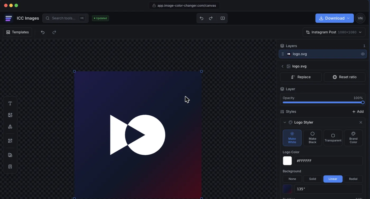
That's the gap ICC Images is built for. Upload the logo, pick a color or hit make it white or black, and export — no layers, no clipping masks, no color-profile archaeology. Editing and previewing are free and don't need an account; downloading a full-resolution file needs a free sign-in and spends credits, and AI operations like background removal are pay-per-use rather than a monthly commitment.