How to Replace a Color in Photoshop (4 Methods, and Why the Edges Go Wrong)
Replace Color, Hue/Saturation on a targeted range, Color Range plus a fill layer, and Selective Color — which to use when, and why a recolored logo keeps a halo of the old color along its edges.
Everything that goes wrong when you replace a colour in Photoshop comes from one fact: every method here builds a mask from colour similarity, and the pixels along an anti-aliased edge are not the colour you selected. A red logo on transparency is not "red pixels then nothing". It is red pixels, then a one-to-two-pixel ramp of progressively lighter, less saturated red, then nothing. Select "red" with any tolerance you like, and that ramp is partly in and partly out.
That ramp is the halo. It is why the recoloured logo looks right at 100% and shows a rim of the old colour at 400%, and why it becomes obvious the moment the file lands on a background that is not white.
Pick a method by what you are working on:
| What you have | What you want | Method |
|---|---|---|
| A photo, changing one object's colour | Natural-looking, keeps texture | Method 1 — Replace Color |
| A photo, more control, non-destructive | Adjustable later | Method 2 — Hue/Saturation, targeted range |
| Flat artwork or a logo | Exact hex, hard edges | Method 3 — Color Range + fill layer |
| A print file, shifting a colour family | CMYK-aware nudge | Method 4 — Selective Color |
| A logo where the old colour must be gone | Exact hex, no halo | See "the edge problem" below |
Method 1 — Replace Color, the direct one
Best for: a first attempt on a photograph. Fast, and destructive.
ImageAdjustmentsReplace Color gives you an eyedropper, a Fuzziness slider, and Hue/Saturation/Lightness sliders that apply only to what the eyedropper selected.
Duplicate the layer first
⌘J/Ctrl+J. Replace Color is an adjustment applied directly to pixels — there is no adjustment-layer version of it, so this duplicate is your only undo once the file is closed.Sample the colour
Open the dialog and click the colour you want to change. Switch the preview radio to Selection — you now see a black-and-white mask where white is "will change". Read this preview, not the image.
Add to the selection with the plus eyedropper
Almost nothing in a real photo is one flat colour. Use the
+eyedropper to click several points across the object — highlights and shadows both — rather than pushing Fuzziness up to compensate.Set Fuzziness by watching the mask
Raise it until the object is solid white in the preview, then stop. One notch past that point and the mask starts leaking into similar colours elsewhere in the frame, which is what produces the mysterious recoloured patch in the corner.
Move Hue, then correct Lightness
Hue does the work. Saturation and Lightness are there because a large hue shift usually changes perceived brightness — a yellow-to-blue swap in particular will look far darker unless you lift Lightness.
Method 2 — Hue/Saturation on a targeted range
Best for: the same job as Method 1, but non-destructive and adjustable next week.
Add a Hue/Saturation adjustment layer
From the Layers panel, not from the Image menu. This is the whole point — it stays editable.
Switch Master to a colour range
The dropdown at the top reads Master by default, which affects everything. Choose Reds, Blues and so on to limit the effect. Leave it on Master and you have recoloured the entire image.
Tune the range with the colour bars
The two bars at the bottom of the panel are the actual control, and most people never touch them. The inner markers set the range that changes fully; the outer ones set the falloff. Drag them to match your object rather than accepting Photoshop's default six-segment guess.
Use the on-image eyedropper
The hand-with-eyedropper icon lets you click the object and scrub left/right to shift its hue directly, which sets the range for you far more accurately than picking "Reds" from a list.
Method 3 — Color Range plus a solid fill layer
Best for: logos, icons, flat artwork, and any case where you need an exact hex rather than a shift.
Methods 1 and 2 move the existing colour. This one selects the region and paints a new colour into it, which is the only way to land on a specific brand value.
Select > Color Range
Click your colour, and set Fuzziness while watching the greyscale preview. For flat artwork you want this low — 10 to 25 — because the colour really is uniform.
Turn on Localized Color Clusters if the colour appears twice
The checkbox limits the selection to pixels near where you clicked, so a red mark and an unrelated red button elsewhere do not both get selected.
Add a Solid Color fill layer
With the selection active, click the adjustment-layer button and choose Solid Color. The selection becomes its mask automatically. Type your hex.
Set the blend mode
Normal replaces the colour outright — correct for flat artwork. Color keeps the underlying light and shade — correct when the object is shaded or textured.
Refine the mask edge
Click the fill layer's mask and open Select and Mask. This is where the halo gets dealt with — see below.
The edge problem, and how to actually fix it
This is the part most tutorials skip, and it is the reason your recoloured logo looks wrong on a dark background.
Shift Edge, negative. In Select and Mask, pull Shift Edge to around −10 to −20%. This contracts the mask inward so the fill covers the ramp rather than stopping short of it. Overdo it and the shape visibly thins.
Decontaminate Colors. Also in Select and Mask. It rewrites the colour of semi-transparent edge pixels to match the subject instead of the old background, which is exactly the halo you are fighting. Note that it forces output to a new layer — that is expected.
Layer > Matting > Defringe. On a layer that already has transparency, Defringe at 1–2 px replaces edge pixel colours with nearby non-edge ones. It is the quickest fix when the file is already cut out.
Method 4 — Selective Color, for print work
Best for: nudging a colour family in a CMYK workflow without touching anything else.
ImageAdjustmentsSelective Color works in ink percentages rather than hue: choose Reds, then add or remove cyan, magenta, yellow and black within only the red pixels. It cannot make a red into a green, so it is the wrong tool for a brand-colour swap. It is the right tool when a printed red is coming out too orange and you need it two points more magenta.
Use Absolute rather than Relative when you want the slider values to mean what they say; Relative scales them by how much ink is already present, which makes small corrections very small indeed.
What goes wrong
When Photoshop is the wrong tool for this
For a photograph, Photoshop is the right tool and it is not close. Selective Color, range-limited adjustments and Select and Mask are genuinely without equal, and if you are recolouring a car in a product shot you should be here.
For flat artwork the calculus inverts. Replacing one hex with another in a logo is conceptually a single operation, and Photoshop makes it a five-stage pipeline — selection, fuzziness, fill layer, blend mode, edge refinement — where four of the stages exist to compensate for the fact that a colour-similarity mask is the wrong abstraction for flat colour in the first place. Then you do it again for the next variant.
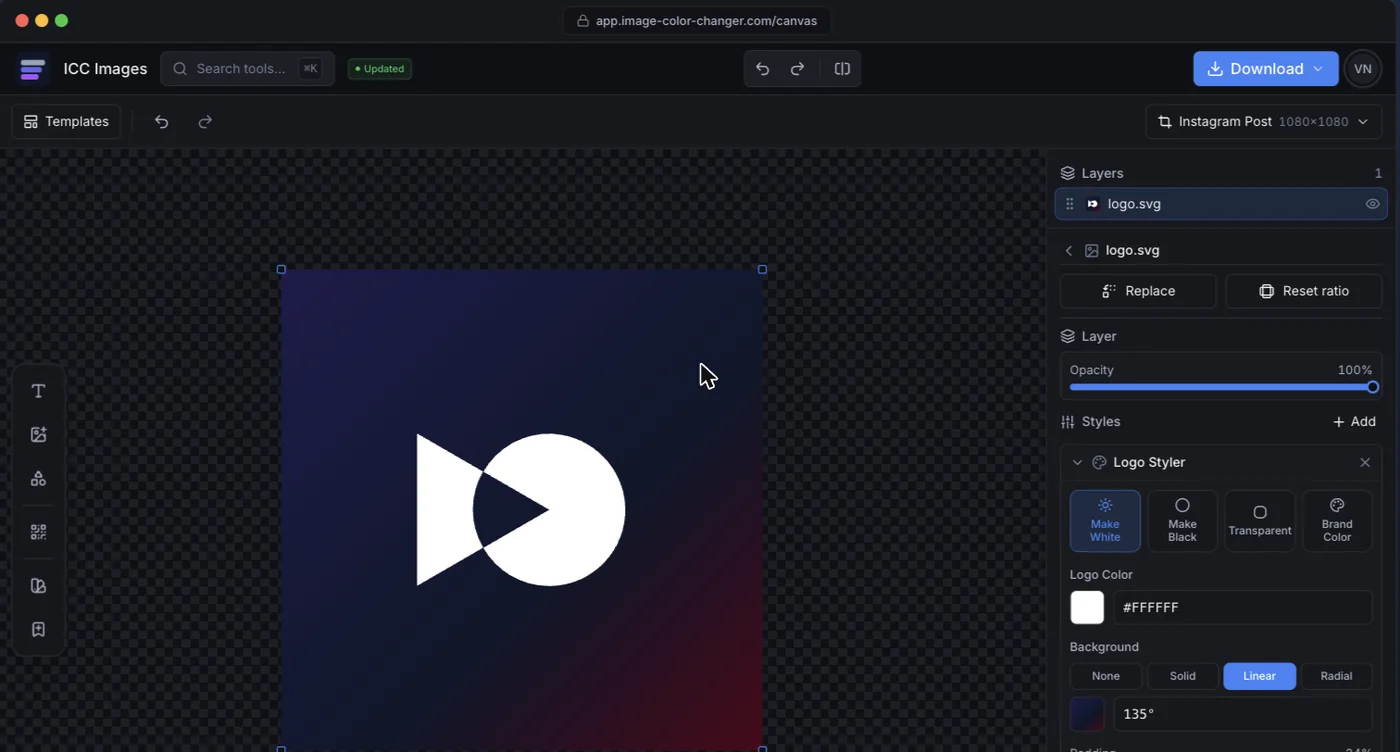
ICC Images approaches it as the operation it is. Replace a colour by picking the hex to find and the hex to put in its place, with a tolerance control specifically for the anti-aliased edge. SVG colour changer does it losslessly on vector files, and batch recolor applies the same swap to up to thirty files at once. Editing and previewing are free and need no account; full-resolution download needs a free sign-in and spends credits.